Programming Tools:prgtools
Components of the FormDesigner Foundation
The FormDesigner is started by double-clicking the corresponding icon in the Xbase++ folder or by entering XPPFD on the command line. The main window of the FormDesigner is initially displayed together with a blank form. The new form is an XbpDialog window into which GUI controls, or Xbase Parts, are inserted. The Xbase Parts are selected by clicking corresponding icons in the main window of the FormDesigner.
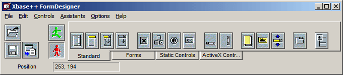
Main window of the FormDesigner
The main window is divided into three sections: menu bar, tool bar, part palette and status line. All functions of the FormDesigner can be selected via the menu bar. The major functions are integrated into the tool palette and are accessible by clicking corresponding icons with the mouse. For comfortable usage, the icons are contained in three tabbed pages.
The following is a list of the commands available through the tool bar of the FormDesigner.
Commands in the tool bar
| Command | Description |
|---|---|
 |
Opens a form that was saved previously |
 |
Saves the current form as a binary file |
 |
Generates code for the current form |
 |
Switches on test mode |
 |
Switches off test and reactivates edit mode |
The form is a dialog window which is edited by the Xbase++ FormDesigner. GUI controls are inserted into this form and can be arranged or modified. If no pre-existing form has been loaded into the FormDesigner, the form is empty and does not contain any Xbase Parts.
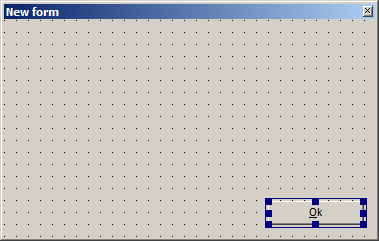
Form with a push button element
The main window and the form are complemented by supplementary windows which are opened via the menu system and are not permanently visible. These supplemental windows are described in the following sections.
Property monitor
Clicking the menu items "Options->Property monitor" opens a window which isused to change proprties of Xbase Parts contained in the form. It uses a tree view for visualization of the parent-child hierarchy and is equipped with a browser which displays the properties of the current Xbase Part. If properties are changed in the browser, the corresponding Xbase Part is updated with new data.
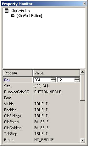
Property monitor
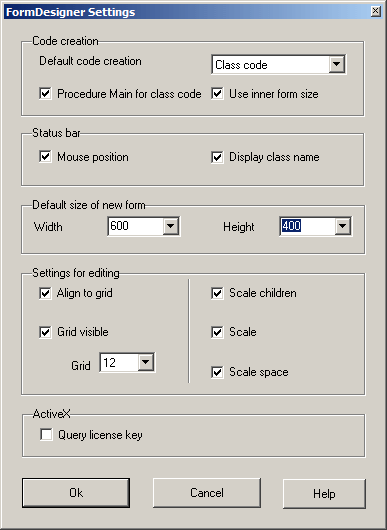
Settings dialog
In this dialog, configuration settings are defined for the FormDesigner and the Form, respectively (Options->Settings). These settings are stored in the XPPFD.XFI file.
Settings dialog
Code creation
In this combo box, the default type of source code which is created when the {bmc gener1.bmp} icon is clicked, is selected. If Class Code is selected, a checkbox defines whether or not a PROCEDURE Main is to be included in the PRG file after the code for the class declaration. If Use inner form size is checked, the code generated sizes the form based on the inner dimensions. Otherwise, the form will have the same outer dimensions as on the development machine. Please note that the user's desktop settings may affect the space occupied by window borders, and the screen area available for placing form elements may therefore be different. We recommend to enable the Use inner form size option to ensure form elements will be displayed as designed.
Status bar
Two checkboxes define whether or not the class name of the Xbase Part below the mouse pointer and|or the position of the mouse in the Form is displayed in the status bar of the main window.
Default size of new Form
The initial size of a new Form can be set according to the screen resolution using the two spin buttons Height and Width.
Settings for editing
Settings in this group box configure the Form:
Align to grid
If this checkbox is selected (x), Xbase Parts can be moved in the Form only in steps defined by grid size.
Grid visible
This checkbox determines whether or not the grid is visible. If visible, the entire Form is repainted when changes are applied.
Grid
The spin button defines the size of the grid.
The three checkboxes on the right side switch automatic scaling on or off. If the marking frame in the Form is resized, the marked Xbase Parts can be scaled accordingly in different ways:
Scale children
If this checkbox is selected, the size of children (contained Xbase Parts) of an Xbase Part is adjusted proportionally.
Scale
If this checkbox is selected, the size of all marked Xbase Parts is changed proportionally to the change of the marking frame.
Scale space
If this checkbox is selected, the spacing (distance) between marked Xbase Parts is changed proportionally to the change of the marking frame.
ActiveX
Query License Key
If this checkbox is selected, the FormDesigner automatically integrates the license keys required for creating ActiveX controls. If a licensed ActiveX control is placed on the Form, its license key is included into the CLASS or FUNCTION code generated. See the function AutomationRequestLicenseKey() in the Xbase++ reference documentation for further information.
Variable names dialog
Defines the variables names used to identify the controls in the form in generated code.
Variable names dialog
Each entry in the list box at the bottom of the dialog corresponds to the name of an element in the form. Elements which have not had a name assigned are referenced using default names such as "MLE1" or "TreeView2". These default names are created based on the class name of the corresponding Xbase Part. In order to increase readability of the source code of the form, it is recommended to assign meaningful names to all elements which are likely to be used in code. Whereas static elements such as group boxes often are not manipulated once they are created, push buttons will need to have a code block assigned which triggers the button's behaviour, for example. In this example, the variable containing the push button should have a meaningful name assigned to make it easily identifyable in application code.
To do this, an entry in the bottom list box must first be marked. This transfers the entry's name to the entry field above the list, and hence makes it available for editing. Pressing the RETURN key in the entry field assigns the changed name to the corresponding form element.
Clicking "Ok" updates the form with the changes made in the variable names dialog. The "Cancel" button closes the dialog without changing the form.
Tab order dialog
Changes the tab order of the controls in a form. The tab order defines the order in which the user can cycle through the elements in the form using the tab key.
Tab order dialog
The tab order is specified in the tab order dialog by means of two list boxes. The left list box represents the tab order of the Xbase Parts contained in the element currently selected in the form. The tab order can be rearranged by using the up and down buttons to move items up or down as needed. The item(s) to be changed first need to be marked in the list box before the up and down buttons become operational.
The right-hand list box can be used as a temporary cache. Xbase Parts which are moved to this list box can subsequently be reinserted into the left-hand list box at a certain location in the tab order. Using the cache eases changing the tab order in forms which have a large number of child elements. To do this, the elements to be moved first need to be marked in the tab order list box. Afterwards, the selected elements can be transferred into the cache by clicking the right arrow.
Clicking the "Ok" or the "Apply" button realizes the changes made in the tab order dialog. "Cancel" closes the dialog without applying making changes to the form. If a tab page is marked when the tab order dialog is opened, the left-hand list box contains the child elements of the tab page. The items in the list box identifiers for the Xbase Parts which are to remain in the form when the window is closed. The right list box displays identifiers for those Xbase Parts which are to be deleted from the form. The Delete key deletes marked items from the left list box which are then copied to the end of the right list box. The Insert key deletes the current item of the right list box and inserts it at the current position in the left list box. Alternately, copying items from one list box to the other can be done by clicking the pushbuttons ">>" or "<<".
Field assistant
Selects database fields and inserts controls suitable for editing the field values into the form.
In the first step, the database file which contains the desired fields must be specified. To do this, the folder with the databases must selected, either by typing in the path to the folder, or by selecting the folder using the directory button. Once the folder is defined, the field assistant lists all database files located in the folder in the left-hand list. The desired database file must now be selected in that list, which causes the assistant to display all the fields defined in the file. The fields appear in the list box at the right.
Field assistant dialog with a database opened
In order to create form elements for one or more fields in the database selected, the desired field(s) must now be selected in the right-hand list. To do this, the corresponding entries must be clicked with the mouse while holding down the Shift key.
Once the desired fields are specified, suitable form elements can be inserted into the form. This can be done either by clicking "Insert", or by clicking the "Ok" button which also closes the dialog after the last step is completed. "Cancel" exits the dialog without making changes.
Form with data-bound controls created by the assistant
Inserting form elements is done by first dragging an insertion rectangle to the desired location in the form, and then clicking the left mouse button or hitting the RETURN key. The insertion rectangle is displayed automatically by the assistant if the "Ok" or "Insert" button is clicked.
Alignment palette
Contains commands for aligning form elements.
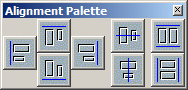
Alignment palette
The following table lists the commands available in the alignment palette. All commands operate on the current selection, that is, they require form elements to be marked in the form.
Commands in the Alignment Palette
| Command | Description |
|---|---|
 |
Align elements at the left |
 |
Align elements at the top |
 |
Align elements at the right |
 |
Align elements at the bottom |
 |
Center elements horizontally |
 |
Center elements vertically |
 |
Make all elements the same width |
 |
Make all elements the same height |
Feedback
If you see anything in the documentation that is not correct, does not match your experience with the particular feature or requires further clarification, please use this form to report a documentation issue.